
Narrative analytics: An example based on banking app reviews
(Maps viewable on desktop only)
We took a small sample of 2,669 banking app reviews for 6 UK banks, and ran them through narrative analytics to understand what drives the experience of banking app users.
The maps can be built with any type of unstructured language: Research verbatims, social media, news, and more. This technique does not pre-set the categories: The axes and clusters are based on the language in the app reviews and are unique to this dataset, from trillions of possible combinations. This customized clustering helps to avoid the bias and blindspots of pre-set categories.
Every dot in the map below represents a single review. Hover over the dots with your cursor. Note the slider on the lower right of the map below. The 4-cluster view shows the high-level axes of the map. The left side of the map is about the functional deliver of the app. The right side is about the bank, and the feelings and experiences of the user.
Adjust level here
Now move the slider to the right, to the 24 cluster view in the map above
The narrative clusters are more than functional/rational ‘topics’ – they are experiential. Clusters like “Superlative bank: Modern ideal” capture a strong experiential driver - showing that a large number of customers are experiencing a big change in their expectations. There are many ways people choose to express this experiential concept, making it difficult to measure through existing text analysis tools or topic models. Narrative analytics is unique because it can measure these seemingly abstract themes.
Finding the 'hotspots' based on the app rating score
The below map is exactly the same as the 24-cluster level of the above map. The only difference is that the dots are coloured based on the app rating score. What does it tell you about the drivers of negative vs positive experiences? When a customer or employee rating score changes, narrative analytics is a way to understand the "why". Why are people giving low scores, and why are they giving high scores? The answer is easily found in the map.
Mapping the customer experience "footprint" for each bank
The below map is also the same, with the dots coloured by the bank name. By clicking on the legend on the right side, you can select specific banks. How is the customer's app experience different for Revolut, compared to Starling?
Detractor analysis: What is driving detraction for different banks?
The bar chart below is based on the 9-cluster level (the middle level) of the top map. We isolated the angry app reviewers: the ones who gave the lowest possible rating score of 1 on the 5-point scale. The number of detractors is similar for each of the three banks in the chart below. However, the story is very different when we look at the drivers of detraction for each bank, based on the map. For HSBC, App UX is the driving 58% of detractors. For Lloyds, Bugs and gaps are driving 57% of detractors. And for N26, 62.7% of detractors' reviews are about service shortfalls.
This illustrates the simple actionability of narrative analytics. The score alone is not always actionable. When we know the score along with the narrative, we understand what to fix: quickly, easily, and clearly. In the HR space, Phrasia does the same type of analysis to understand the drivers of employee engagement, ENPS and churn (for example).
Narrative analytics: How to look at the maps
By exploring and interacting with the narrative maps, teams can discover and measure the drivers in their business, through the voice of their customers and s takeholders. Although the deep learning technology used for narrative analytics is complex, we have designed the approach to be intuitive for non-technical people. Before you get started, below are some simple tips.

1. Every dot is a statement
Each dot in a map represents a unique, full statement made by a person, with each of the dots arranged into clusters. Hover over the dots with your cursor to read some of the statements. Each statement appears only one time in a narrative map
2. Look at the levels
Each map has high level themes which show the axes. Note that the axes are opposites, from left to right and top to bottom. Use the slider to see the more detailed narratives within the high level themes. This helps you see the full shape of the conversation.


3. Consider the surrounding clusters
Clusters appear near other clusters which are similar in meaning. By looking at the clusters within the "neighbourhood" of clusters near by, you can understand the related issues experienced by employees, customers, patients or stakeholders.
4. Zoom in
On PC, use Ctrl +/- to make the dots and text bigger or smaller (Command +/- on Mac). To explore a specific cluster or part of the map more carefully, you can use the zoom function at the top right. Select it, then you can click and drag to select the area you want to explore. When you click the "home" icon, the map will return to normal.


5. Consider the 98%
The map provides a '98% view' of the landscape. In classifying thousands of statements into just 20 or 30 narrative clusters, there are always some that don't fit perfectly. Still, a 98% view is a significant step forward compared to subjective opinions, or other technologies which - on a good day - capture perhaps 50% of the drivers.
6. Focusing on the signal, versus the noise
By modelling narratives against other data such as eNPS, review scores, etc, companies can make better decisions on what to focus on, and more quickly create an action plan based on a better understanding of drivers. This also helps teams decide what NOT to do. Narrative analytics can also be a strong foundation for predictive analysis, applied to customer or employee churn, sales growth, commodities prices, and more.


What is unique about narrative analytics, compared to other approaches?
1. Every map is unique: Nothing is pre-set
~10
2568
possible cluster/axis combinations
Each map is unique to the dataset, and unique to your company. Narrative maps are created from a huge number of possible combinations of clusters - based on the unique views expressed within your data. This means the analysis is tailored to your business. For this reason, the clusters in narrative maps often correlate more strongly to outcomes, compared to standard one-size-fits all approaches or performance models.
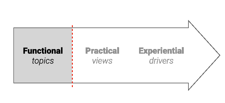
2. Narratives - not just topics
Standard analytical techniques capture topics. A narrative is bigger than a topic, capturing real-world context and experiential drivers:
This allows teams to understand the "reason why" behind the scores. The result is faster, clearer understanding and actionability.

VS

AI Chatbots:
built to talk
Phrasia
built to hear
3. How does it compare to AI chatbots?
Narrative analytics is built on some of the same LLM and deep learning technology as AI chatbots. However, with narrative analytics, the algorithm is 100% focused on hearing, not talking.
Chatbots are designed to give the 'most likely' response to a question. By design, they provide the 'conventional' answer, ignoring outliers which may signal emerging risks and opportunities. Narrative analytics reveals the full landscape, making it easy to detect outliers, and emerging themes, as well as the most common issues.
4. Supporting - not replacing - human judgement
Narrative analytics is designed to involve and engage
people. The transparency of the narrative maps make it easy
to involve non-technical stakeholders in refining and improving
the maps.

VS
Lagging
indicators
Leading
indicators
5. Leading indicators for faster action
Most data dashboards rely on structured data which measures behaviour and outcomes: these are lagging indicators which can leave teams reacting to the scores. Narratives often change before the inflection point when outcomes are decided. For this reason, narrative analytics can help companies intercept early signals in their business, to more proactively manage their business.
Thank you for viewing these case studies. If you have any questions, please contact info@phrasia.com.